Must-Have Chrome Extensions for Responsive Web Design Testing (Updated for 2025!)
Jun 3, 2025

Ensuring your website looks perfect across all devices is a must in 2025. Whether you’re a designer, developer, or tester, Chrome extensions can significantly speed up responsive web testing. In this post, we’ve updated our original list by adding three new must-have extensions, making it a total of 8 powerful tools for responsive design testing.
Why Use Chrome Extensions for Responsive Testing?
Manually resizing your browser or relying solely on developer tools can be slow and inefficient. These extensions provide quick previews, device emulation, and multi-screen testing, helping you spot layout issues before they affect users.
Let's take a look at the Chrome Web Store and highlight some of the hidden gems. These extensions are valuable tools that every web professional should have for top-notch visual testing:
Pixefy
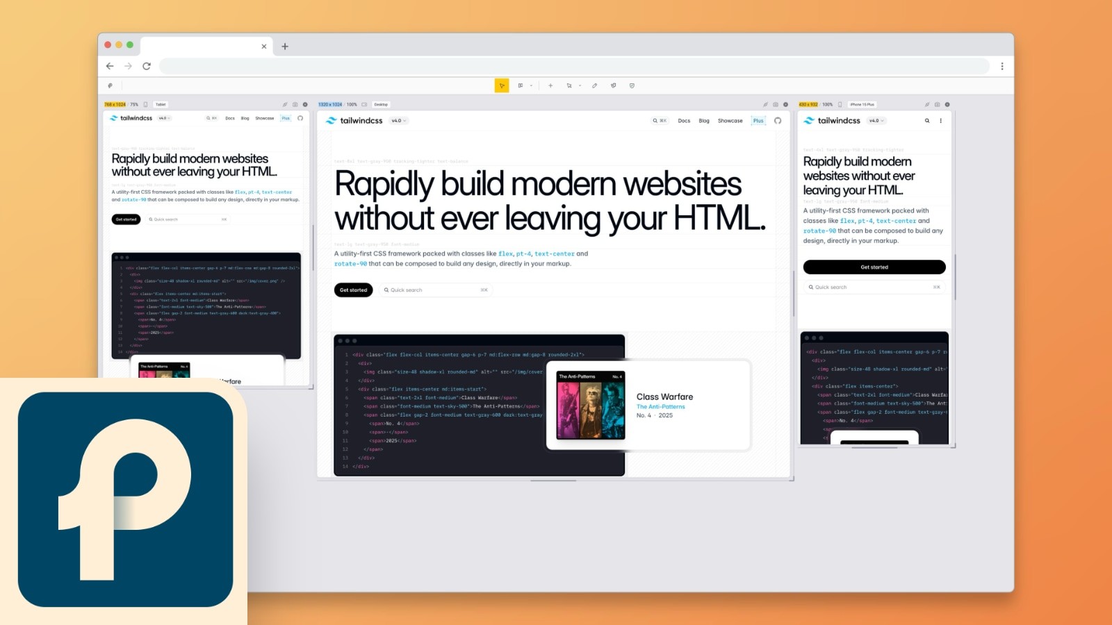
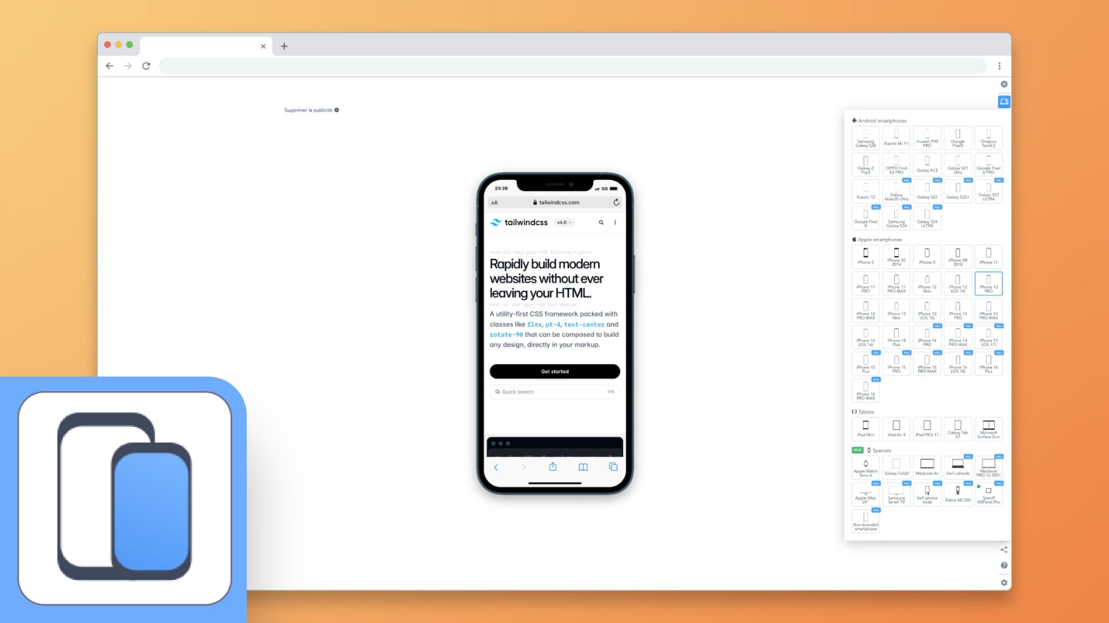
Pixefy changes the way you test how your site looks and behaves on different screens. It cleverly synchronizes everything and lets you see your website on multiple devices simultaneously without switching between tabs or windows. The best part? It can mimic how your site appears on actual devices by changing user agent strings. This gives you a true representation of your site's responsiveness. What used to take hours of detailed testing now takes just a few seconds.
✅ Has | ❌ Lack |
|---|---|
Multiple screen preview Split screen view Single screen view Synced events Presets Custom presets User agents Dark mode Has more tools! | Device mockups |
Responsive Viewer
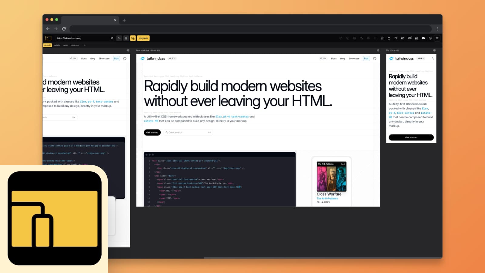
Similar to Pixefy, Responsive viewer allows you to check how your website looks on different screen sizes. It's great for anyone looking to do serious visual design testing and identify layout issues that need attention. If you prefer dark mode or work at night you'll find this tool comfortable to use.
✅ Has | ❌ Lack |
|---|---|
Multiple screen preview Single screen view Synced events Presets Custom presets Device mockups Dark mode Has more tools! | Split screen view User agents |
Responsive Tester
If you prefer a straightforward approach, Responsive Tester might be the best choice. Open this extension, select a device from the dropdown, and you'll see your site as if it's being viewed on that device. It's a simple and easy way to do a quick responsive check.
✅ Has | ❌ Lack |
|---|---|
Single screen view Presets | Multiple screens view Split screen view Custom presets User agents Device mockups Dark mode |
Mobile View
Mobile view is easy to use. Simply choose your devices and start navigating. Your website will be displayed on one screen, giving you a clear view of its performance. Its standout feature is its broad support for multiple frameworks, including React, Vue, Angular, & more, making it highly versatile. The only downside is that it doesn't allow for custom screen resolutions. But considering its ease of use and framework compatibility, it's a small trade-off for a significant benefit.
✅ Has | ❌ Lack |
|---|---|
Multiple screens view Synced events Presets | Split screen view Single screen view Custom presets User agents Device mockups Dark mode |
Mobile simulator
The Mobile simulator extension is a gem for designers. It lets you preview your designs in a range of device mockups complete with animated iOS or Android interfaces. It also includes a screen recording feature, allowing you to capture your navigation as GIFs for easy sharing or review. Whether you need the full suite of features or just want to try it out, there's both a free and a paid version available to suit your design needs.
✅ Has | ❌ Lack |
|---|---|
Single screen view Presets Device mockups Dark mode Has more tools! | Multiple screens view Split screen view Custom presets User agents |
Responsive Website Testing Toolkit - Multiple Viewport Simulator
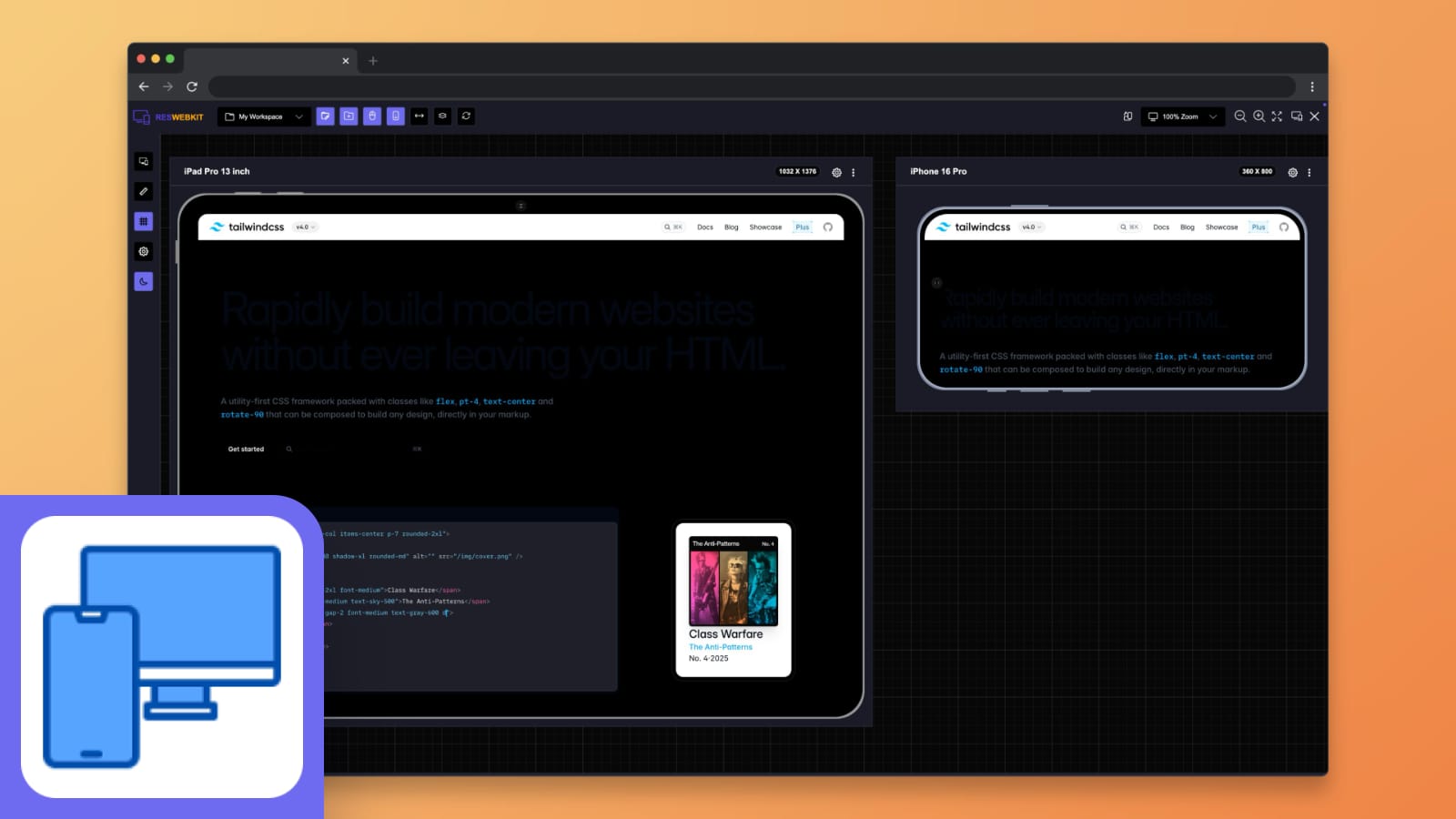
If you’re already using Pixefy or Responsive Viewer, you’ll find Responsive Website Testing Toolkit to be a similar tool for multi-device testing. Like Responsive Viewer, this extension allows you to preview your website across different screen sizes simultaneously, making it easy to catch responsive issues in real-time. While it functions almost the same, Responsive Website Testing can be a useful alternative for developers looking for a different approach to responsive testing.
✅ Has | ❌ Lack |
|---|---|
Multiple screens view Synced events Presets Custom presets Device mockups Dark mode Has more tools! | Split screen view Single screen view User agents |
Viewport Resizer: Ultimate Device Emulator
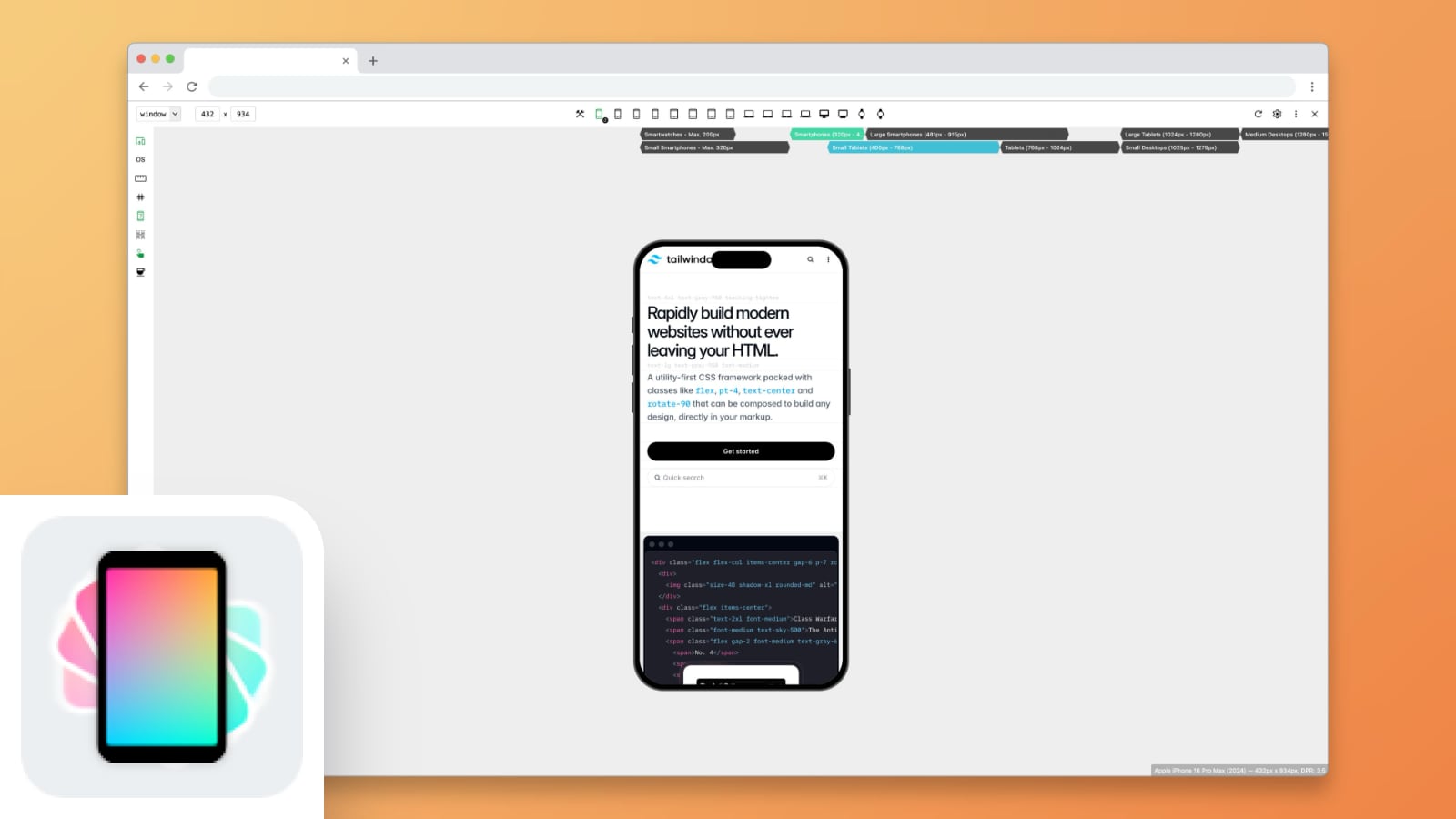
Viewport Resizer is a must-have for developers who need an easy way to test different screen sizes without relying on built-in developer tools. This extension allows you to instantly preview your website in various resolutions, simulating real device sizes. You can also customize breakpoints and save frequently used viewports for faster testing. This extension is particularly helpful if you’re working with flexible layouts and want a quick, repeatable way to test across multiple devices.
✅ Has | ❌ Lack |
|---|---|
Single screen view Presets Device mockups Dark mode Has more tools! | Multiple screens view Split screen view Synced events Custom presets User agents |
U-Eyes: Mobile Device Simulator
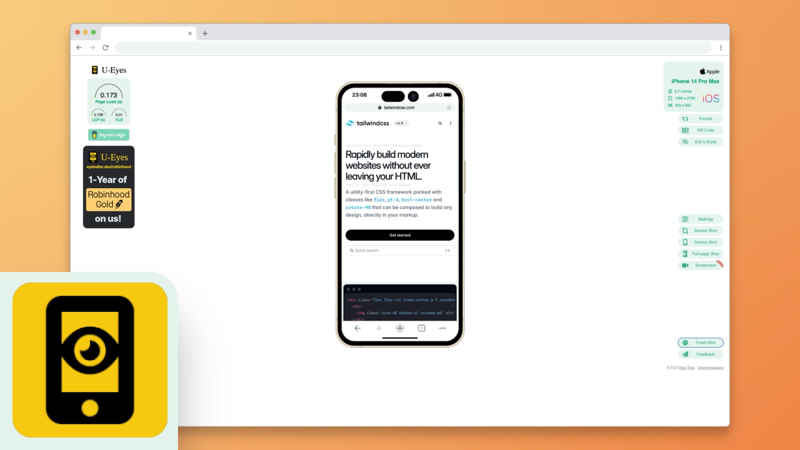
For those who want a highly visual mobile testing experience, U-Eyes offers an intuitive simulation of mobile devices right inside your browser. It provides accurate screen scaling, making it ideal for designers and developers looking to ensure their mobile layouts look pixel-perfect. Unlike some other simulators, U-Eyes also lets you monitor page load performance, Largest Contentful Paint (LCP), and Cumulative Layout Shift (CLS) - a solid addition for performance testing!
✅ Has | ❌ Lack |
|---|---|
Single screen view Presets Device mockups Dark mode Has more tools! | Multiple screens view Split screen view Custom presets User agents |
Why These Extensions Matter
Responsive design is no longer just a nice-to-have; it's essential in our mobile-centric world. These Chrome extensions are your tools for ensuring your website meets the mark, making it user-friendly for anyone, on any device. Adding these tools to your toolkit during development and testing phases is a significant step towards building websites that are not just accessible & engaging but also professional.
Remember, the key to nailing responsive design is a cycle of testing, tweaking, and testing again. So, dive in & enjoy the process. Happy testing!


Available in the

Available in the
